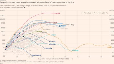
If like Pulse+IT these days you are getting your jollies hunting down maps and graphs of the coronavirus outbreak, you might have come across the great work being done by Financial Times data-visualisation journalist John Burn-Murdoch. Each day, he tweets out multiple visualisations of the pandemic and its growth in multiple countries, large and small.
He likes to keep his eye on the disasters in Italy, Spain, the UK and the US of course, but also regularly mentions certain countries that appear to have managed the outbreak pretty well, especially the ANNAs: Australia, New Zealand, Norway and Austria.
